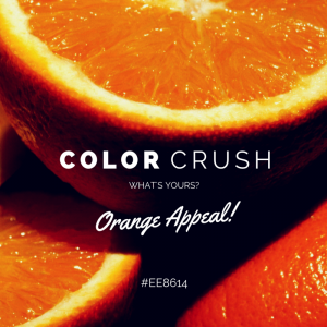
Which of the below images are you most likely to share or engage with?
While it is a well-known fact that images have more social media reach than any other form of content, it is only the visually rich creatives that have the power to connect your brand with your audience.
But a mere knowledge of this fact doesn’t automatically generate great content. One needs to put in effort to come up with visually rich and engaging social media posts.
If you’re spending too much time on designing but still not satisfied with the output, here are 8 simple tips that can transform the way you design your social media marketing creatives –
Photography Rules – Try using some of the popular photography rules in order to compose your creative. Where should you place your text? And how should you position the callout bubble? These questions can be simply answered if you understand composition. Getting the composition right can help you increase the appeal of your post multi-fold. Learn up some quick composition rules and use them in your creatives. Click here to read some of the top 10 composition rules- http://www.photographymad.com/pages/view/10-top-photography-composition-rules
Minimalism – Design is not just about what to include in your creative but also what not to. This is the underlying principle of minimalism, one of the most recent design styles that has dominated the internet. Simply put, don’t make a list of things that need to be included in your design. Instead, make a list of things that do not need to be included. Try to communicate with as minimal visuals as possible. You need to be extremely witty or humorous when making a minimalist design. It might seem a little difficult in the beginning but won’t take long for you to master it.
Copy First, Design later – Get your copywriters to write the copy before you design. This can help you as a designer to choose the right visual elements that complement the words. The more relevant your copy and image are, the more chances your audience will engage with your post.
Use Readable Fonts – One of the major challenges of designing for social media is to make your creative look appealing on various platforms. As part of this, you need to ensure your post is readable whether being accessed from the desktop or the mobile. One suggestion would be to use a family of fonts that has been optimized for web. Google Fonts (https://www.google.com/fonts) offers hundreds of fonts that can make your posts look appealing on all platforms.
Use Web Safe Colors – Another way to ensure your design looks consistent on every platform is to use web safe colors. There are 216 colors that have been determined as web-safe, which means they will look consistent on all browsers on all platforms. You can access info about these colors here – http://html-color-codes.info/web-safe-colors/
Researchers found that colored visuals increase people’s willingness to read a piece of content by 80%. (Source)
Avoid Gradients – A background with a gradient is more likely to distract your viewer than grab his attention. Using too many colors or a gradient of colors can lower the visual appeal of your creative. Try and stick to solid colors as much as possible.
Contrast for Highlighting – Contrast is a great tool to highlight important elements in your creative. Say, you have to make an ad for the copy “20% discount on latest stock”. The best way to ensure you make an attention grabbing design is by using contrasting colors for the background & foreground. This way the text stands out. Even within the copy, you could use contrasting size for the text. For ex: ‘discount’ can be written in a bigger font size than the rest of the words to grab the viewer’s attention.
Think Like your Audience – Often, it helps to think from the point of view of your target audience. Imagine you are scrolling through your news feed. What kind of posts will grab your attention? Make a note of the elements that make these posts stand out. Use different fonts, colors and elements for different audience sets. For example, warmer colors might work better for women while cooler colors might appeal better to men. Similarly, figure out what works best for various target groups.
Some of the above tips might seem overwhelming in the beginning. But once you understand them and put them to practice, you can easily master them.
So, design your way to greater reach and more engagement. May the likes be with you!


